30 October 2015

Part 1 Surface Distortion Project 5 Exercise 2 Stitching

Exercise 2 Stitching

I began this exercise by punching holes into cartridge paper and then stitching through the holes with a perle thread. 


I then tried to punch holes into bubblewrap.  Punching the holes was not successful.  The plastic bubbles obviously burst when punched but did not give a clean punched hole.  I then sewed thread through the holes (the holes were only in the top layer of the bubble wrap) using perle thread and a strip of dyed torn cotton fabric knotting inbetween passing through the holes.  I like the way the threads show up showng the patterns made very clearly.  However I did not like the feel of the bubblewrap to work with.  I prefer fabric and paper.


I decided to turn back to paper and punched holes into tissue that had been used to mop up paint and ink.  The holes were more like rips.  I passed gimp thread through the holes pulling gently as I passed the thread through.  This caused the tissue to gather making a more textured surface.  The tissue was so delicate though that the rips just became larger and I think the piece became messy.  I can see that this technique would work better with a more substantial paper or fabric.


I had been mopping up some Quink ink that I had used for a previous exercise and had used tissue.  I was pleasantly surprised and pleased with the colours that had emerged when the ink was watered down and bled into the tissue.  I threaded jewellery wire through holes that had been punched into the tissue.  Again the holes became rips which I expected but wanted to see how the wire could be manipulated to raise the surface of the tissue.  The tissue was too delicate and just ripped more as I played with the wire.  Again I can see that this would probably work better with a more substantial fabric.


The sample below is a piece of dyed cotton scrim.  I punched holes through using a kebab stick and then threaded twisted tissue through the holes.  The tissue became more substantial as I twisted it making it easier to thread through.  Even thugh the tissue paper is delicate the twists make it look sturdier and it stands out against the delicacy of the scrim.  I like this because I like the contrast between them.


I do not think the next sample was successful.  At least the part with the wire.  I punched holes nto the muslin with an awl.  I first threaded twisted wire through the holes.  It gathered the fabric together but I think it looks messy .  I found it very difficult to work with the wire and muslin so I decided to thread the rest of the holes with twisted tissue as I had done in the previous sample.  I wanted to see how this looked closer together and against the fine weave of the musline.  I think it looks quite effective because the tissue looks heavier against the fine muslin.
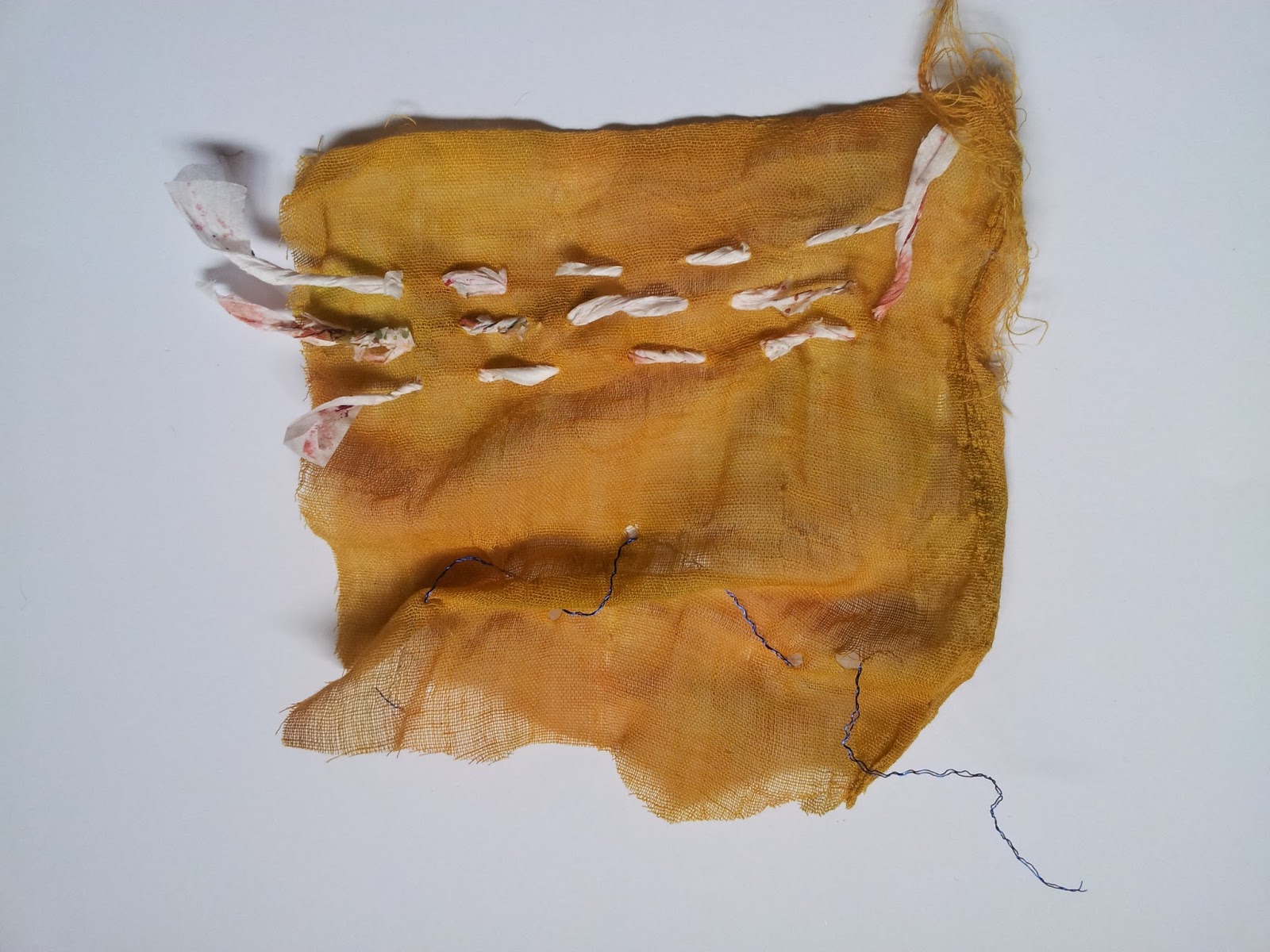

I had liked the colours of the watered down Quink ink so decided to use this to colour more tissue and kitchen roll.  I have noticed that colour effects the way I work a lot.  I seem to be able to free up more and I think become more experimental when I am working with colours that I find attractive.  When I view anything be it a piece in an exhibition, textile or paintings, it is the colour that attracts me first and then texture.  I am having to learn to look past the colour at pieces and see more in the technique and thought that has gone into something.  I am enjoying this but do find it difficult when working with colours that do not inspire me.

So I worked with the kitchen roll and tissue coloured with the ink.  The kitchen roll was obviously more substantial than the tissue.  I pleated a piece of kitchen roll then punched holes through the pleats with an awl whilst the pleats were still folded.  I then threaded torn strips of silk through and pulled the pleats apart at intervals.  I like the way the folds made the paper much more substantial to punch through with the awl.  I was surprised at how much stronger the paper had become just by folding it.


I then did the same folding with another piece of kitchen roll and threaded jewellery wire through the holes.  Again the punching was a success because the paper was strengthened with the folds.  The wire made it more difficult to manipulate the paper as although it was a soft wire and quite bendable the firmness it had made it quite inflexible when I tried manipulating the paper around it.


To strengthen the kitchen roll further I applied it to a fusible heavy weight interfacing.  I punched this with a darning needle and then threaded jewellery wire through the holes.  This enabled me to manipulate the piece bending the wire and making soft folds with the paper.  I like this because I can see potential to develop this into 3D pieces.


I applied tissue to heavy weight interfacing.  Holes were punched through the folds with an awl and then torn silk strips were threaded through the holes.  The piece was then pulled apart to show the silk threaded through.  I particularly like the texture of this piece because the creases on the tissue stand out against the sharp lines of the folds.  I think this invites you look in between the folds rather than just at the shape.  Again I can see the possibilities for 3D pieces with this.  Also it reminds me of the old corsetry.


I punched holes into a piece of tissue that had been applied to heavy weight interfacing and then threaded through/sewed various threads and fabrics into the holes.  I used raffia, fine wool thread, torn scrim and torn silk.  I worked a large open chain stitch with the wool.  I think this worked well and I can see the surface being made more textured by layering stitches like this over the paper.  I particularly like the raised surface that the scrim has made where I have threaded it through close together.  I like the fact it is very tactile.  I like the cross stitches I have done with the silk for the same reason.


I was recycling some leaves from corn and was drawn to look at them further because of the texture the fibres made.  I like the lines that when you look at them closely the look like very fine pleats.  I decided to see if I could punch into a leaf with a darning needle.  The hole became splits which I should have realised they would because of the structure of the lines on the leaf and the fibres are actually quite delicate.  I sewed some variegated thread through the splits at random intervals leaving the thread loose as I drew it through the next hole.  I actually like the delicacy of the thread against the leaf.  I think that in hindsight I would have used a different coloured thread and not a variegated one as the colours are detracting from the texture of the piece.  


As I said previously I have a big thing about colour and this time of year is my favourite because of the lovely rich colours of the changing leaves.  I particularly like the burgundies and the yellows.  I love the contrast of these colours and when I am walking the dog always come home with a fistful of leaves.  I decided to punch holes into a dried leaf that I had collected and then sew thread into it to raise its surface.  Obviously this was difficult because the leaf would break - I rubbed it with a little handcream to make it more workable.  I think I should have used a different thread - maybe a more contrasting colour and perhaps finer. Also the hole could have been spaced closer together but this would cause problems of the leaf being more likely to break.


26 October 2015

Part 1 Surface Distortion Project 5 Exercise 1 Puncturing

Exercise 1 Puncturing


I began by puncturing cartridge paper with the tip of a craft knife.  Some holes were punctured closely in lines and others further apart.  I also pulled the blade at an angle whilst puncturing and this gave a little slashed cut that I think gives a nice texture to the underside of the paper.  Overall I like the effect the craft knife has given to the paper because the punctured holes look delicate in contrast to the way in which they were made and the tool used.

I punctured cartridge paper with a bradawl.  This was very easy to do and gave a textured effect to the holes on the reverse of the paper.  I spaced the holes at different intervals and think the most effective are the holes punched randomly but closely together.

I then used a darning needle to punch into handmade cotton rag paper.  This was successful and showed a nice texture on the reverse of the paper.  Again I spaced the holes at different intervals some in line and others randomly.  I like the holes punched randomly because I think this gives a a nice texture over all. 

I punctured a piece of painted kitchen roll with a darning needle.  The underside of the paper has a nice texture but I also think the front where the needle entered the paper has a nice neat effect.

Part of a photograph in a newspaper and plastic were punctured with a needle. The newspaper shows the holes quite clearly and where the paper has ripped gives a lovely texture to it.

The plastic does not show the holes quite so clearly but when touched a lovely raised surface can be felt.  I feel this was not so successful because the patterns cannot be seen clearly  Plastic was also punched with a hole punch and again these do not show up very clearly as well as not having good texture.  

Painted cartridge paper was punched at intervals with a hole punch.  The holes show very clearly and different patterns could be made with different placement of the punch.  Looking at this now I could I have layered the sample over a different coloured background and I think this would have given a very nice effect.


I decided to puncture some dyed felt and vilene with a bradawl and the tip of a craft knife.  The pieces of felt that were punctured with the bradawl have a nice raised surface where the fibres have stayed raised when the awl was removed.  These surfaces do not stand out that well unless you look at them in a certain light.  The felt that was punctured with the craft knife has more of a raised surface.

The vilene punctured with the bradawl shows the holes quite well but the surface remains flat.  The piece punctured with the craft knife does not show any holes or texture.  The holes are small slashes that can only be seen by handling the vilene.  This was obviously not successful in that the vilene needs to be punctured with a punch or a sharp object that is round not flat like a craft knife.

A piece of Lutrador that had painted bondaweb applied to it was punctured with the bradawl.  This was unsuccessful.  The holes cannot be seen at all unless the piece is moved around in the light.  


Part 1 Surface Distortion Project 4 Embossing Exercise 1

Exercise 1 Embossing

I used cartridge paper placed over the side of a plastic basket to emboss the woven shapes on the side.  This came out quite well give a good negative and positive effect on the paper.  The raised areas are very tactile and I liked the way this turned out.  

I then did the same thing with handmade cotton rag paper and this also turned out well giving a good texture to the paper which already had a slight texture to it.

I used watercolour paper rolling the edge of a paintbrush handle into it.  This was not as successful as the previous samples but a slight raise in the paper can be seen.  

I rolled cartridge paper over a thick darning needle this has shown a row of quite raised lines.  

I did not find this exercise easy as I somewhat scrabbled around to find things to emboss with and found many to be unsuccessful so I became a bit disillusioned with my samples.  


Part 1 Surface Distortion Project 4 Exercise 2 Scratching

Exercise 2 Scratching

I began by colouring cartridge paper with neocolour crayns and scratching into this with a craft knife.  I like the effect this has given and could see this as layered fabrics either cut into or lots of fine lines of stitching on top.


I coloured cartridge paper with fibre tipped ens and painted black gouach paint over the tope.  When this was dry I scratched marks into it with a craft knife.  This gave a nice texture but did not work as well as I had hoped.  It was difficult to scratch into the gouach without tearing the paper but this is what gave the nice texture so partly successful I think.


Next I coloured cartridge paper with oil pastels and scratched lines and patter into this with a kebab stick.  This worked well and I like the definition between the scratched lines and the untouched pastel.


Again cartridge paper was covered with oil pastels but using two colours and was scratched into with a craft knife.  The scratching was easy to do but I do not think it looks as effective as using one colour.


I painted cartridge paper that had been previously painted with inks and acrylic paints with white gouache.  Acrylic wax was applied to part of the paper and the whole was scratched into with a kebab stick.  I really like the effect of this sample.  The patterns that were scratched in show clearly and I particularly like the part of the paper where the wax was applied.  This gives a mottled effect to the background but the scratched patterns are still clear.


Cartridge paper sponged with acrylic paint and when dry gouache paint applied and scratched into whilst still wet with a fork.  I like the straight lines on the left of the sample the best.  I like the way part of the acrylic paint in the background shows through.  The squiggly lines did work but I think do not look as effective as the straight lines.  They have more texture though.


This sample has been painted at either end with Quink ink.  The middle has been left so that the original background can be seen.  When the ink was dry I scratched into it with a craft knife.  This has given lovely textured lines and curves.  They remind me of the slashed work on Tudor clothing.


06 October 2015

Part 1 Surface Distortion Project 2 Tearing and cutting Exercise 2

Exercise 2 Cutting edges

Using A4 printer paper I followed the instructions for Exercise 2 and cut the paper into a series of evenly spaced strips down one side.  As suggested I made small slits along the uncut edge and pushed the strips through the slits. As I did this I decided to cut the slips at different heights along the edge.  I did this in threes so that the first strip was pushed through the lowest slit just a little so that a long loop was left.  The next strip was pushed further into the next slip higher up leaving a shorter loop and the final strip pushed through the highest slit and pulled through to make a short loop.  I continued along the piece of paper in this way.  I liked the edge that could be made with the loops and that the length of each loop could be played with to made a different edge.  I liked the flexibility of the paper when cut like this. I liked the reverse side of the edge when the paper was bent and the different length strips inside wove over each other.
I again used A4 printer paper to cut a fringe down each side of the sheet with the strips 1cm in width and 10cms long.  The uncut centre being about one and a half centimetres in width.  I decided to join the fringe edges together with thread and began by sewing through each strip about half way down the strips.  As I went along I then decided to sew through the strips near to their edge and then reverted towards the end back to the middle of each strip.  The sample could then be twisted.  I pushed down on the sewn fringe and liked the area where I had sewn halfway down the strips because of the 'V' shapes that formed along the strip edge.  I liked the combination of the harshness of that shape with the softness of the rolls that were made from the strips as then were brought together from the centre to the sewing edge. 


Using cartridge paper that I had applied tissue to and painted and sponged paint onto the reverse side I cut a fringe on one side of 2cm width strips and a fringe of 1cm strips down the other side.  I cut slits into alternating 2cm strips and threaded through alternating 1cm strips.  This I think worked well giving a slight twist to the piece.  It was sturdy and was easy to manipulate.  I like the crispness of the piece in look and handling.  I also like the effect the colour gives.  The brightness of the lightly sponged underneath to the textured deeper colour of the green top.  I think this is because it allows the twist and the method to be shown clearly.

I then decided to use a material that was softer but still paperlike.  I had some kitchen roll that I had mopped up paint with and had cleaned print linocuts with.  I liked the effect this gave and decided to cut fringes along either edge of 2cm width strips but cut on a slant.  The kitchen roll could be manipulated well but to keep the manipulated strips in place I used thread to sew along as I folded the strips over. I decided to use thread because the kitchen roll was too fragile to push strips through slits and because I wanted to incorporate stitch.  I like stitch and paper.  One side I folded over continuous strips and this made a nice soft curled over edge.  The other side I sewed alternate strips over.  I do not like this side as much as the other because i don't like the look of the unfolded strips against the folded ones.  I think this is because of the width of them making them look cumbersome.  

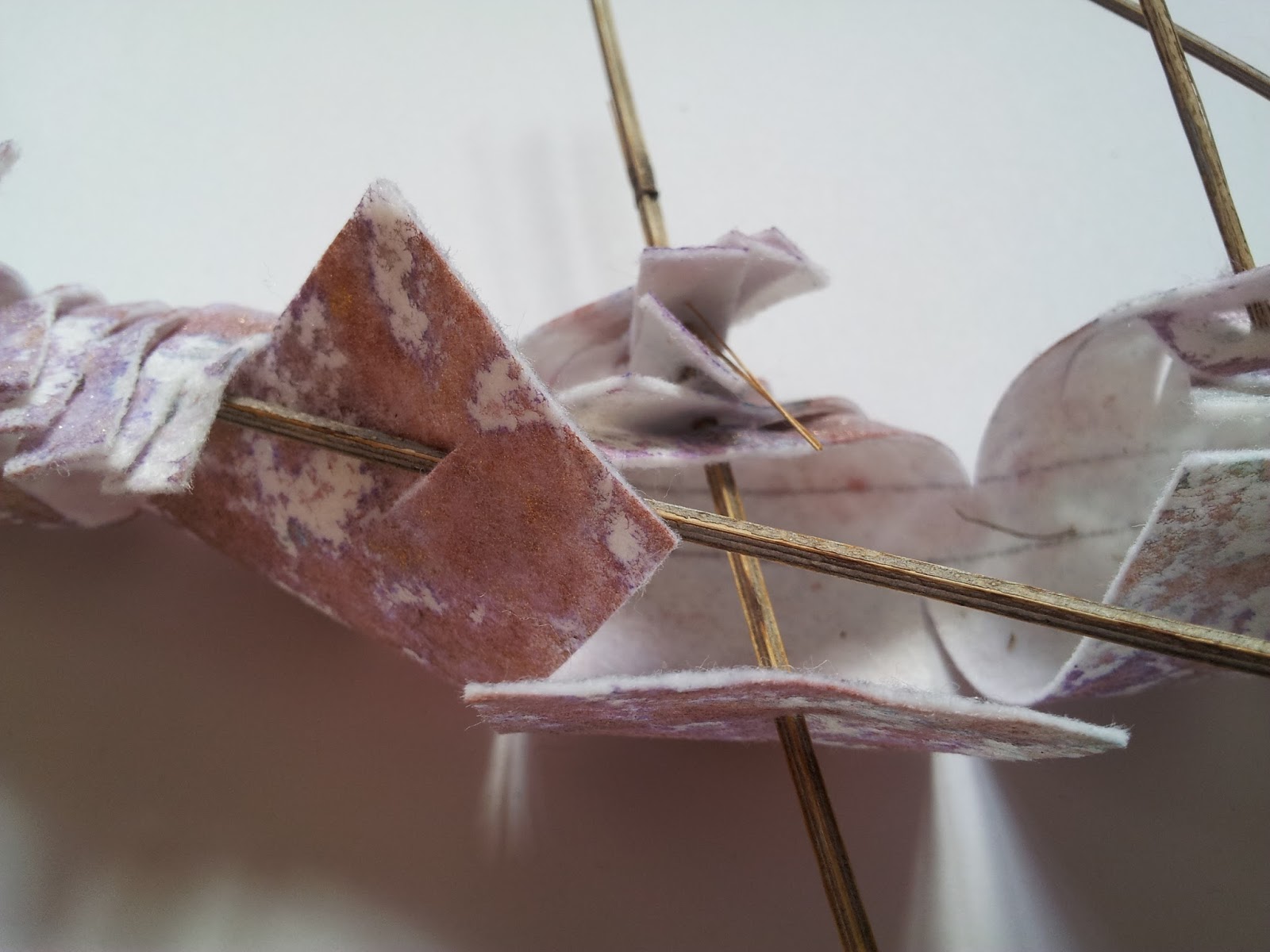
The decided to use a fabric but wanted to manipulate something substantial so I cut fringes along a length of vilene that I sponged with acrylic paint leaving a 1cm uncut area in the centre.  The strips were cut 4cms wide along one edge and 1cm wide along the other.  All the strips on both sides then had a slit cut into them toward their edge.  I tried to thread through the thin strips into the wider strips but this was unsuccessful.  I think this was because they were all too short being approximately 3cms in length and it just looked messy and would not stay formed.  I decided I needed something more substantial to thread through each strip.  I had dried some lavender last year from my garden and had kept the stalks as well as the seeds.  I threaded the strips with the lavender stalks threading 3 or 4 strips at a time onto one stalk.  I did three then threaded one stalk through the remaining strips along the length of the piece.  

I really like vilene and lavender stalk sample.  I am pleased with the way it is being held together but can be twisted and manipulated in different directions. The lavender sticks are firm but delicate and I like the combination of the thin sticks with softer wide strips of the vilene.  Again I like the firmness of the vilene although it is soft to handle.

Printer paper

Printer paper

Printer paper


Printer paper


Printer paper


Printer paper and thread


Printer paper and thread


Printer paper and thread


Painted cartridge paper

Painted cartridge paper


Painted cartridge paper

Painted printed kitchen roll


Painted printed kitchen roll

Painted vilene and lavender stalks

Painted vilene and lavender stalks


Painted vilene and lavender stalks


Painted vilene and lavender stalks


Painted vilene and lavender stalks


References

Vyzoviti, S. (2006). Supersurfaces. Corte Madera, Calif.: Gingko Press.

Vyzoviti, S. (2003). Folding architecture. Amsterdam: BIS.

Greenlees, K. (2005). Creating sketchbooks for embroiderers and textile artists. London: Batsford.

Holmes, C. (2015). Stitch Stories. Pavilion Books.


Embroidery Magazine Article Sept/Oct 2015 Issue

Over the years I have subscribed to a number of stitch and craft magazines.  During that time I have not renewed subscriptions and then taken on new subscriptions to other magazines.  I subscribed for many years to Embroidery then for a period decided it was not what I wanted or needed from a magazine at that time and dropped the subscription.  The point of this is that since starting to study Textiles with the OCA I have been debating which magazines to subscribe to.  I had bought single issues of the ones I liked and had a shortlist but still did not take the plunge to get a subscription.  It was therefore with interest that I read the article in the weekly WeAreOCA on Subscribing to Periodicals by Rebecca Fairley.  This led me to a decision to subscribe to Embroidery magazine.

The first issue in my subscription arrived the other day and I was reminded of what joy I feel receiving such a magazine through the post.  I thought I would just flick through and settle down to a proper read when I had the time needed to do so.  There were many articles that caught my eye but one in particular kept my attention.  This was titled 'the long goodbye' and is an article about a series of portraits called the dementia darnings by Jenni Dutton.  These were made in the beginning as a personal diary but grew into a work of 14 portraits that have been exhibited at London's City Hall.  

As I looked at the pictures I was moved to tears.  Jenni Dutton has captured all the pain and frailty that the disease causes and I cannot think that there would not be anyone moved emotionally by this series of work.  

References

Fairley, R. (2015). Subscribing to Periodicals and Magazines | WeAreOCA. [online] Weareoca.com. Available at: http://weareoca.com/textiles/subscribing-to-periodicals-and-magazines/ [Accessed 6 Oct. 2015].

the long goodbye. (2015). Embroidery, (September/October 2015), pp.20 to 27

Jennidutton.com, (2015). jenni dutton conceptual clothing artist. [online] Available at: http://www.jennidutton.com/index.html [Accessed 7 Oct. 2015].